
It’s high time for some fresh air, wouldn’t you say? Industry experts look to 2022 and see a design landscape infused with colors that make us feel healthy, serene and centered. These clarifying blues, delicate greens and grounded earth tones nudge interiors awake and aim us at a horizon that’s brimming with optimism.
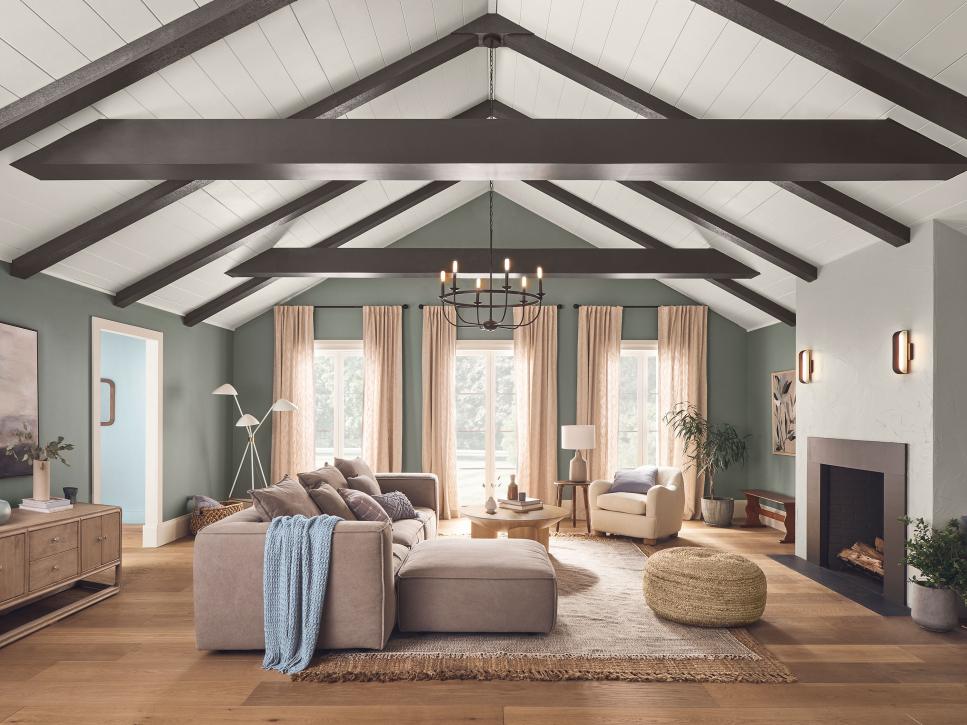
Hues that set the tone for 2021 reflected a collective yearning for the cocooning comforts of home. Urbane Bronze (SW 7048) put a sophisticated spin on design classics from previous decades and served as a new-neutral anchor for another year indoors. We’re looking to step out of that den of nostalgia in 2022, and Evergreen Fog (SW 9130) is the way forward. “Urbane Bronze reflected our need to create a sense of calm, safety and security. Evergreen Fog is the natural next chapter in this story,” explains Sue Wadden, director of color marketing at Sherwin-Williams. “From a color psychology standpoint, green is the color of nature, revitalization and growth. It is naturally emblematic of newness. Evergreen Fog signals growth, emergence and new beginnings.”
“Evergreen Fog is timeless because it’s not overly verdant, it’s a little softer and delicate,” Sue says. “It’s a usable mid-tone that allows you to put a personal stamp on your home without having to jump into really bold or bright color.” This nourishing, sophisticated gray-green with just a whisper of blue pairs beautifully with design styles and décor of all sorts. “For interiors, it’s a really fresh take on cabinet storage in a mudroom, soothing for a space where you want to relax, like a living room or bedroom, and makes a subtle statement in a bathroom. I love it painted on trim paired with white walls,” she adds.
It’s also a natural choice for exterior applications: “I absolutely love it for a front door, or just shutters and trim,” Sue continues. “Because of the gray tones, it would be a soft pop of color to introduce people into your home and give them a soothing welcome before they’ve even walked through the door. I also like how Evergreen Fog would look great in all regions of the country. From the Pacific Northeast to Florida, the color for exteriors is super versatile.”
The light washed indigo is a stunning shade that promotes balance in our home and mental wellbeing,” explains Ashley Banbury, senior color designer for HGTV Home by Sherwin-Williams. Its crystalline calm complements hues throughout Softened Refuge, the brand’s infectious 2022 Color Collection of the Year. “A cool shade with a red undertone helps bring cool and warm shades together,” Ashley says. Consider how gorgeously it washes across architectural details and spans the ceiling in this spacious, restful bedroom; it’s an intuitive partner for swaths of natural wood like this warm flooring, and in the sunlight it practically sparkles.
“As we are continuing to spend more time at home, living and working, Aleutian is an elegant shade in space where we are also seeking to create calm; a beautiful shade in a bedroom or living room but also can be an unexpected soft shade for a home office — creating a cozy calm space that promotes productivity,” Ashley continues. Deployed to great effect in this paneled hallway, it’s a handsome background for a feature wall painted with warm Black Fox
“Balancing the color with decor made from textiles found in nature like light-washed wood, stone, cotton and others is also important as the hue brings the outdoors inside without overpowering the space.” Want inspiration for a feature wall? Try partnering the hue with complementary shades like Sunwashed Brick
Versatility is key to this color’s appeal. “Breezeway’s hue serves as the foundation for a variety of design styles, moving easily from casual to coastal and modern to vintage styling perfect for home offices and living rooms,” says Erika Woelfel, vice president of color and creative services at Behr Paint Company. “Given the amount of time we spend in our living rooms and offices, it’s important to pick a refreshing hue such as Breezeway to brighten these spaces.”
“Our Color of the Year 2022 is inspired by one of our trend predictions for the year ahead – Reclaim,” explains MaryAnne Cartwright, design manager at Graham & Brown. “This trend is all about nature reclaiming the manmade and putting the planet before ourselves. The calming tones of Breathe reflect this trend. The shade is tranquil and natural, bringing the outdoors in, which is especially important as the past couple of years have had us spending more time inside our homes.” Fittingly, the color complements reclaimed and minimally-treated shelves and floorboards, as well as natural materials like rattan and sisal.